YML, 2023 - 2024
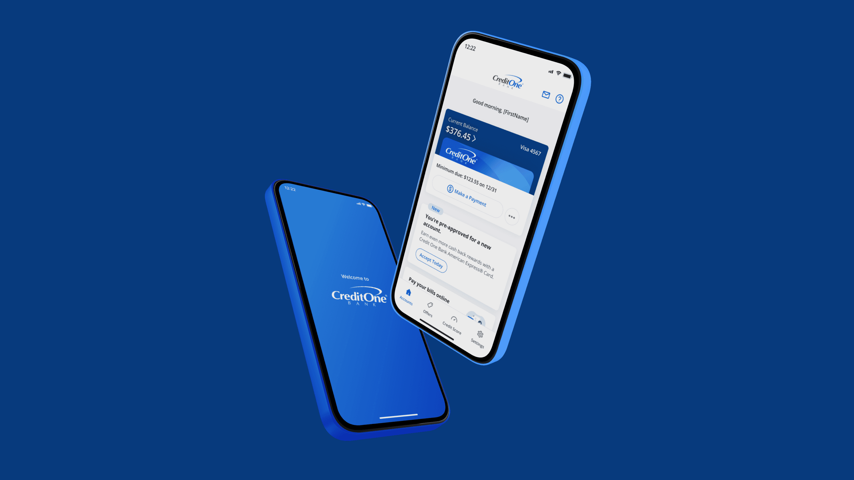
Credit One Bank
Transaction Data Enrichment
Context
Overview
At Credit One Bank, they are dedicated to providing a full range of Credit Cards that reward card members for everyday purchases. Our agency, YML-Code and Theory, had a long-term contract to provide, develop, and maintain the Credit Card App, Digital Banking App, and other endeavors such as the Design System, an Illustration Library, and many other digital solutions.
Over the course of a year, I worked on a variety of projects including UX Research, Visual Design, Design System, Illustration Library, Motion Design solutions, and 3D.
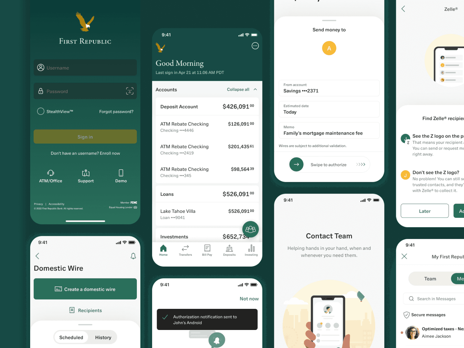
The project we'll be looking at here is a redesign of the transaction details screen. My goal was to help cardholders understand their purchases and reduce chargebacks and cardholder inquiries.
My Role
Given the constraints of being an external team, our agency did a great job of constantly getting us in front of stakeholders, project managers, and more. On this project we had the support from the client, giving us all the information we needed to succeed. The bank also provided a clear briefing and all the technical limitations.
As a Senior Product Designer, I collaborated with directors, project owners, and managers to provide research, user flows, prototypes, and visual design ready for testing and further implementation. I worked very closely with the Bank's Design Leadership. Our design team also consisted of a creative director and a project manager, with whom I worked to develop multiple explorations before we presented them to the client. I led the creative vision and with input from my team, designed all the solutions.
Problem
⚡️ The Challenge: How can we simplify the process of reviewing card statements for the users and reduce the cardholder inquiries, chargebacks and operating costs?
There was much information that we could add to this page to make it easier for the users to scan it and quickly identify the merchant and ultimately the purchase they made. At this point we had constraints and, for phase 1, we limited the improvements to launch faster while improving the overall experience.
Design Process
Research
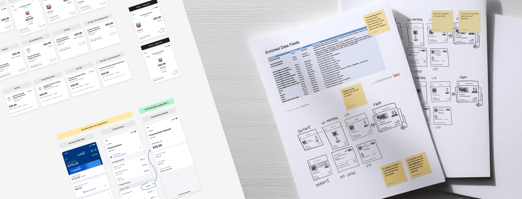
My first step was to understand the technical and businesses constraints and find out how I could leverage it. I researched in-class examples of existing transaction enrichment data, such as VISA developer's guidelines, Apple Card, American Express, Capital One, and more.
Highlights
American Express — Something that we liked about American Express is that it had “on your statement as...”. Problem with this app is that it doesn’t have any option to report a problem, or chat/get help from an agent, like in Capital One and U.S. Bank.
Apple Card — Apple Card is an interesting case, because it has features that other banks don’t have. This might be because Apple also stores a lot of data from its users and using other apps to do so, like Apple Maps.
Takeaways
Convenience — It is convenient to show multiple details about a purchase and getting help. American Express do a great job in providing these details and answer questions that an user might have about its purchase.
Overwhelming details — At the same time, too much detail can be overwhelming or unnecessary, which might be the case of Apple Card. Compared to American Express, this app shows more information about the vendor. Even though this might seem as relevant information, it can be overwhelming to the user, since in most cases the things that they look at the most is the amount spent, the vendor’s name, and a help option if needed.
I also reviewed data containing user interviews with real customers to learn more about how they use the transaction details page to find out about a purchase. They revealed that they find it confusing to connect the merchant name with the real store/business name and the lack of information regarding the merchant led them to contact the bank only to further discover that they, in fact, recognize the purchase.
”It's crazy! If you use your credit card at certain Burger King franchises in Frederick, Maryland, for example, you''ll see "JEFFREY GIANGRANDE CORP" on your statement -- not Burger King.” — Customer
Designing
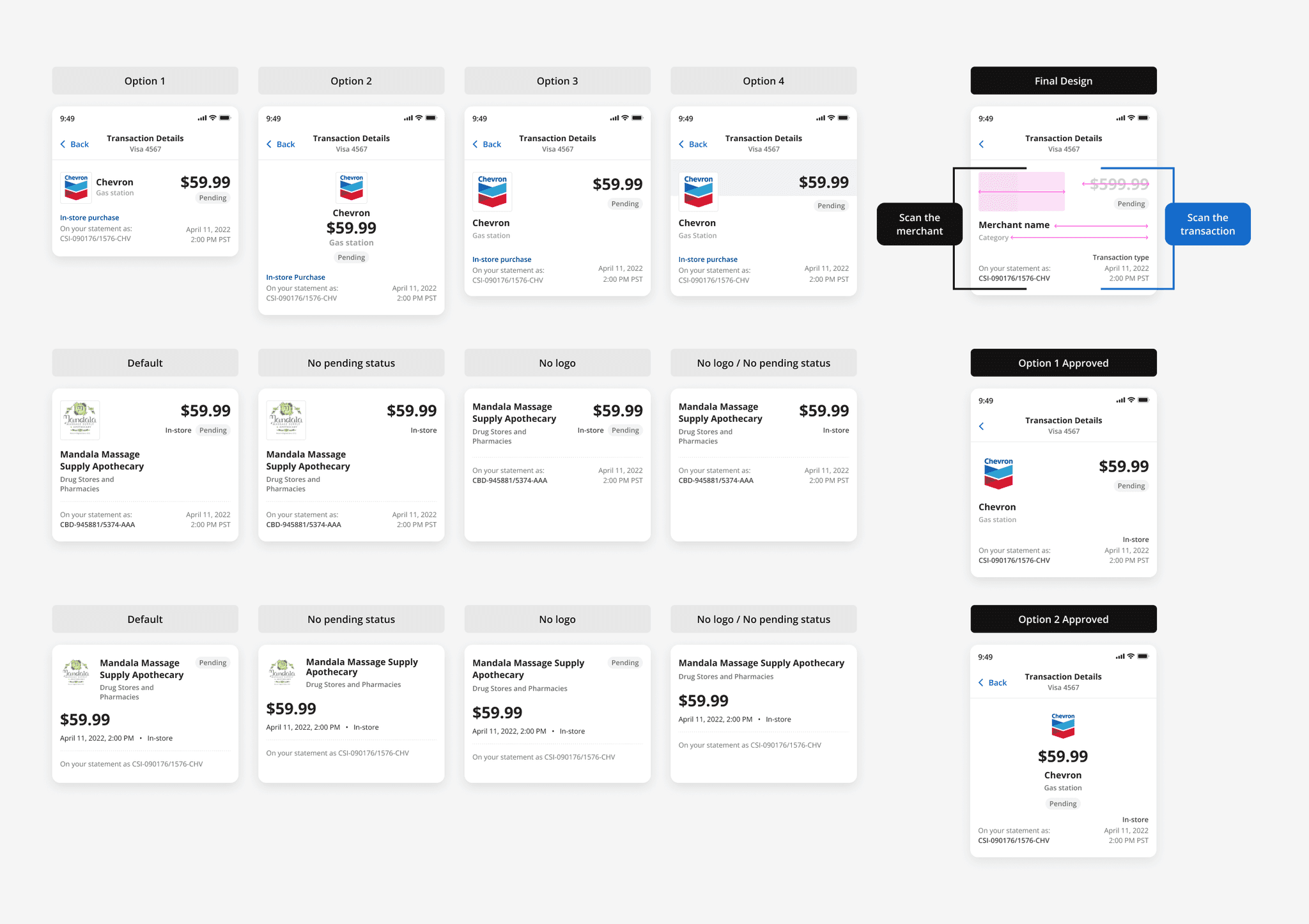
Header
Before I started exploring all the possible layouts for the header I decided to take some notes to help me stay focused on the goal. I narrowed it down to these four questions:
Does the layout show a cleaner card statement?
Does it help me Identify unknown merchants quickly?
Does it improve the customer experience?
Does the user spend less time figuring out a transaction?
No matter the outcomes in the design process it must answer yes to these questions. This helped me a lot while deciding which ones I should move forward with.
Besides these constraints I imposed to myself, I wanted to pressure test it and try how responsive the layout could be, what would it look like in different scenarios such as if the merchant doesn't have a logo or some data is missing. I wanted it to look consistent in all cases.
Designing
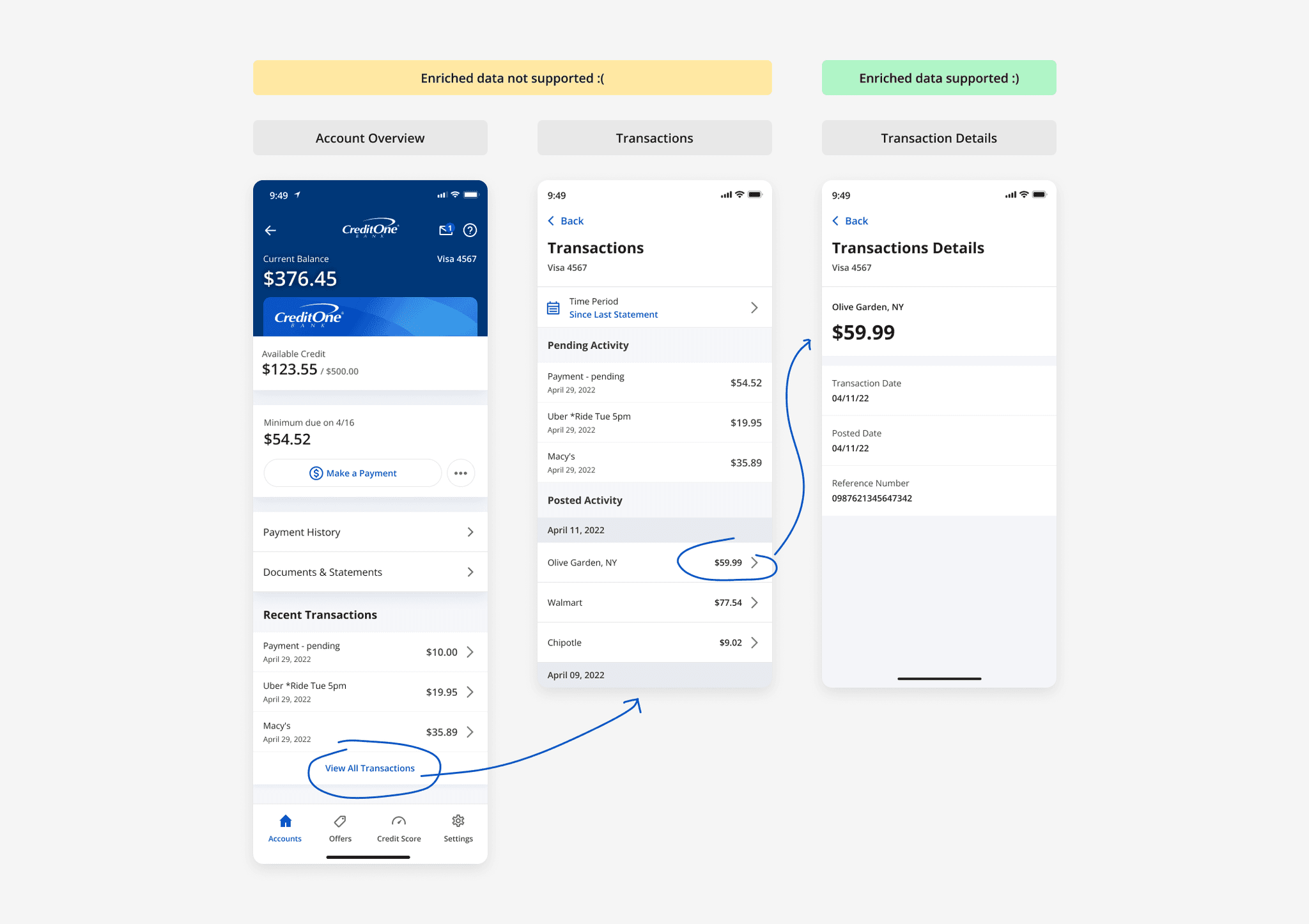
Entry Point
At this stage, Enrichment data would only be supported on the transactions detail page. Users must tap on a transaction in order to see all enriched data. For this project we also had to follow the Developer's Guideline provided by Fiserv (a third part solution). Even tho we referenced Fiserv for all Enriched Data Fields that will be available at the Transaction Details screen the UI was completely up to us.
Designing
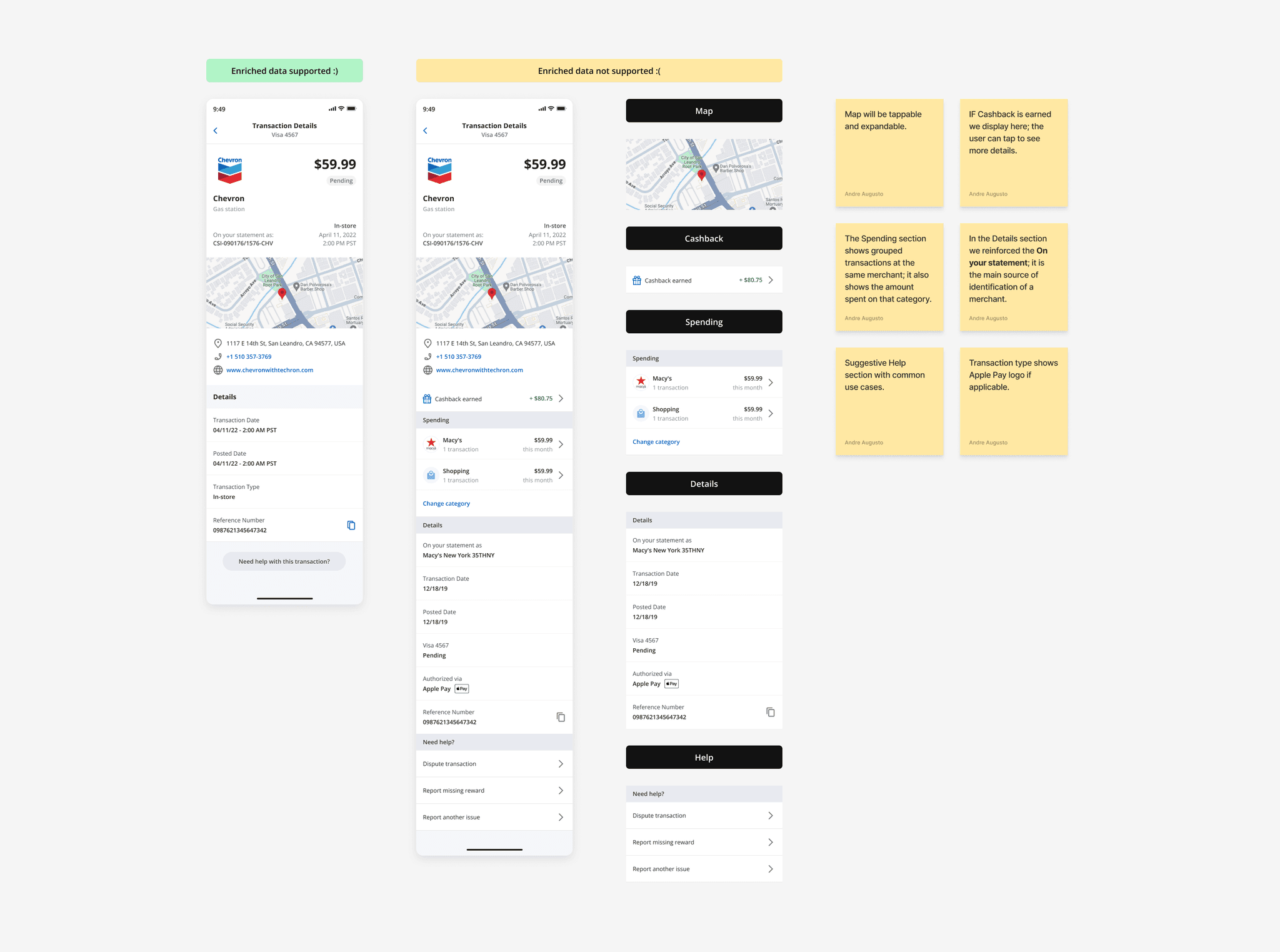
Features
I wanted to explore opportunities to further possibilities on how to enrich the page to better assist the users in the future. How can we give them the best experience they could get without technical limitations?
A designer's job in an agency is to present the client with the best-in-class solutions and, sometimes, that leads to getting new business. It's a common thing. It helps build the ground for the next steps and it positions us as visionary and authorities in the matter.
I found out that, many improvements, although it seemed a small add, could be complex given the architecture and structure of the current app experience but, by aligning it with other projects in development we could make it happen with minimum effort.
Ultimately, the simple and most straightforward design worked best for the business requirements while attending to the user's needs and scoring positively on user testing.
Outcome
Transaction Enrichment Data
I collaborated with my project manager and with external team to provide all the assets, prototypes and layouts to perform user testing.
Takeaways